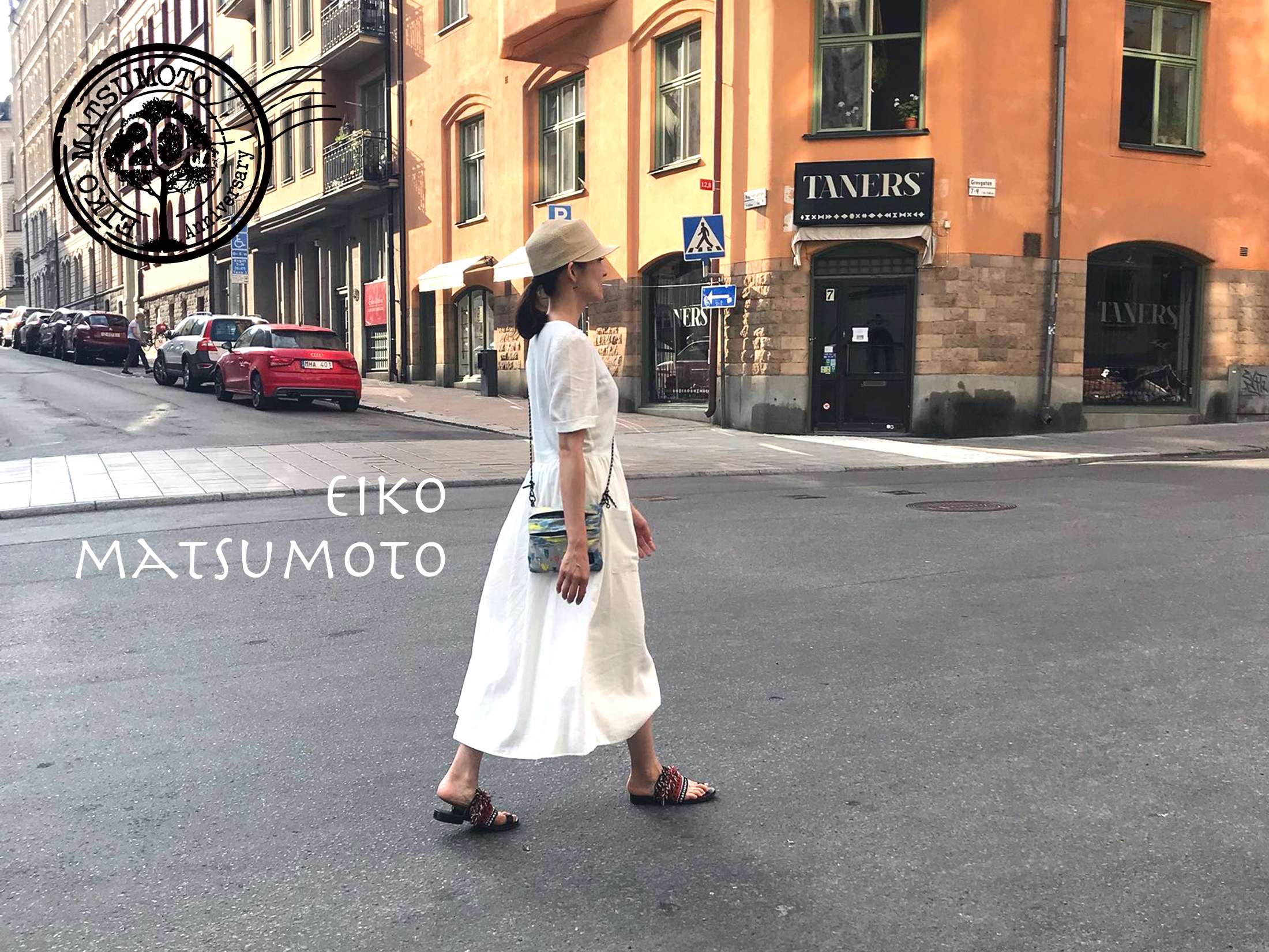
Introducing the special logo for Eiko Matsumoto’s 20th anniversa
2018-09-15
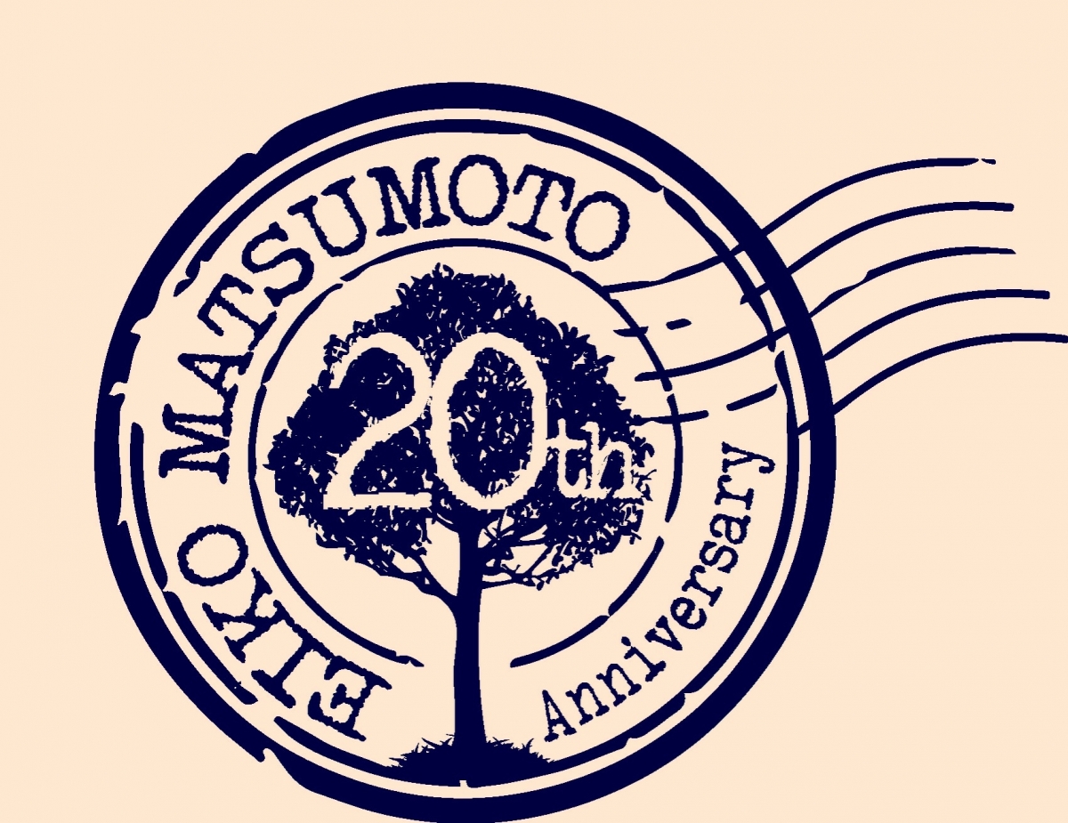
We made a special Logo for Eiko Matsumoto’s 20th anniversary project. It’s designed by Makoto Sato, a.k.a Makochu, who also designed the cover art of her 15th anniversary album “I’m Home.” Eiko’s request for the special logo was “postmark.” The reason behind it is that she is hoping to deliver new works to you as part of the 20th anniversary project. The tree in the logo design is the illustration of Zelkova tree found in Eiko’s hometown in Akita. We are planning to make original merchandise using the logo, so please stay tuned!!
 Guest
Guest
 Eiko Matsumoto
トートバックは間違いなく松本英子本人もスタッフも愛用すると思います!
皆さまにお喜びいただける物をお届けできるよう、がんばります^ ^